How the Bowtie Diagram Maker Works
Learn how to map causes, consequences, preventive barriers, and mitigating controls in one clear bowtie diagram.
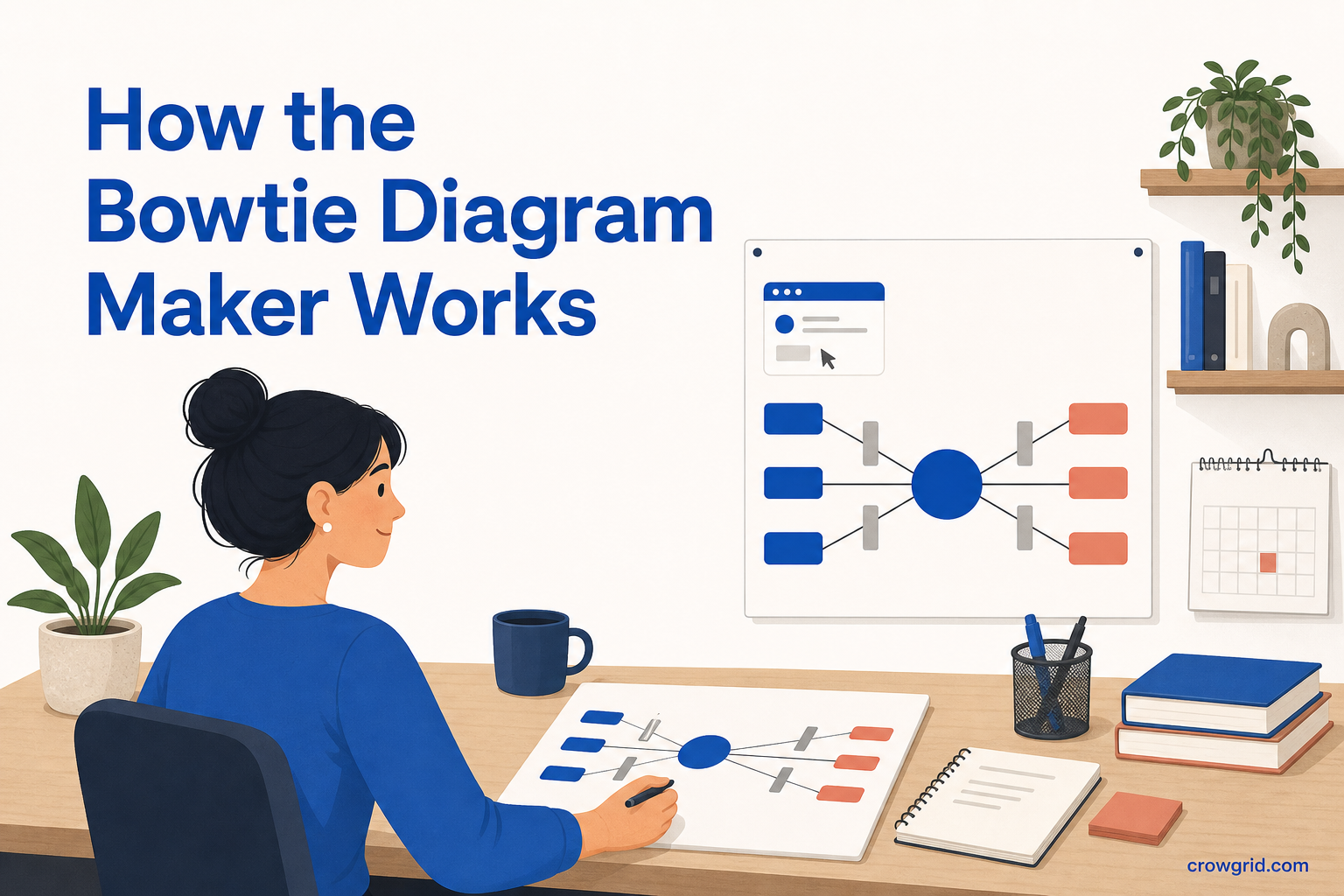
A bowtie diagram brings the main parts of a risk assessment into one visual structure. Causes and threats sit on the left, the central hazard event sits in the middle, and consequences sit on the right. Preventive and mitigating controls show where the risk can be managed.
The Bowtie Diagram Maker gives you a structured way to enter this information and generates the diagram automatically. You can then adjust the content and appearance to suit your risk scenario, project, or assessment.
See the whole risk in one diagram
Risk information is often spread across registers, notes, and control lists. A bowtie diagram places those details around a single event, making their relationships easier to review.
The classic layout answers a practical set of questions:
- What hazard or event are you assessing?
- What threats or causes could lead to it?
- Which preventive barriers reduce the chance of it happening?
- What consequences could follow?
- Which mitigating controls reduce the resulting impact?
This structure is useful when you need to explain a risk to other people, check whether controls cover the main pathways, or keep the rationale for an assessment in one place.
Step 1: Define the hazard
Start with the central hazard event: the risk you want to analyse. This forms the middle of the bowtie and gives every other item a clear point of reference.
Keep the event specific enough to assess. A broad topic may make it difficult to distinguish causes from consequences. A clearly defined event helps you decide what belongs on each side of the diagram and where controls should be placed.
You can also add notes to the element. Use them to record context, rationale, evidence, assumptions, or action items that would make the diagram easier to understand later.
Step 2: Map causes and consequences
Add threats and causes on the left of the central event. These describe what could lead to the hazard event. On the right, add the consequences that could follow if it occurs.
Separating the two sides prevents a common problem in risk discussions: mixing up what causes an event with what happens afterward. The visual layout keeps that distinction clear while still showing the complete scenario.
You can add multiple items to either side and use related-item links to show relationships across categories. Detailed notes can capture supporting evidence, ownership discussions, or follow-up work without crowding the visible labels.
Step 3: Add barriers and controls
Place preventive barriers between causes and the central event. These controls are intended to reduce the likelihood that a cause progresses into the event.
Place mitigating controls between the event and its consequences. These controls are intended to reduce the impact after the event has occurred.
Keeping preventive and mitigating controls in separate positions makes their purpose visible. It also helps you review whether each major cause has an appropriate preventive barrier and whether each significant consequence has a mitigating control.
You can assign colors to different categories so causes, barriers, the central event, and consequences remain visually distinct. Connectors show how items relate across the risk pathway.
Adapt the structure to your framework
The standard bowtie format provides a starting point, but organizations often use different terminology. Custom categories let you rename sections to match your industry, internal framework, or assessment method.
For example, your team may use “threats” rather than “causes,” or a specific term for preventive and mitigating controls. Matching the language already used in your organization can make the finished diagram easier to discuss and maintain.
Each element can include notes for details that do not belong in the main label. This lets you keep the visible diagram concise while retaining rationale, evidence, and action items alongside the relevant item.
Adjust the diagram’s appearance
The visual diagram builder lets you work interactively with shapes, colors, and connectors. You can adjust box sizes, element colors, fonts, and connector styles to match your organization’s standards or make a complex diagram easier to read.
Color coding can provide an immediate distinction between different kinds of information. Consistent box sizes and connector styles can also help readers follow the diagram from causes through controls to consequences.
These appearance controls are useful when preparing export-ready visuals for reviews, reports, or internal discussions.
Keep separate risks in separate diagrams
You can create multiple bowtie diagrams rather than placing unrelated scenarios into one crowded view. A separate diagram can be used for each risk, project, department, or assessment.
This keeps each central event focused and gives its causes, controls, and consequences enough space. It also makes it easier to revisit a specific scenario without sorting through information from other risks.
The free tier includes up to 10 diagrams with 30 items each. Pro supports unlimited diagrams.
Review the risk picture
Once the diagram is built, read it from left to right. Check that each cause has a clear route to the central event and that each consequence follows logically from it. Then review the barriers along those routes.
Look for missing controls, consequences without mitigation, or barriers that are not connected to a specific pathway. Notes can record questions and evidence while related items can make less obvious relationships visible.
A bowtie diagram does not replace the decisions behind a risk assessment. It gives you a structured picture for making those decisions easier to inspect and explain.
Frequently asked questions
What can I customize in a bowtie diagram?
You can customize category labels, element colors, box sizes, fonts, and connector styles. You can also add detailed notes to every element and link related items across categories.
How many diagrams can I create?
The free tier includes up to 10 diagrams, with up to 30 items in each diagram. Pro provides unlimited diagrams. Separate diagrams can be used for different risks, projects, departments, or assessments.
Who is the Bowtie Diagram Maker for?
It is intended for risk managers, HSE professionals, quality teams, and anyone carrying out structured risk analysis. Bowtie diagrams are used in areas including oil and gas, healthcare, aviation, and manufacturing.
Put causes, consequences, and controls into one risk picture with the Bowtie Diagram Maker.