How to Turn an Employee List Into an Org Chart
Learn how to add employees, define reporting lines, and turn a simple employee list into an interactive, shareable org chart.
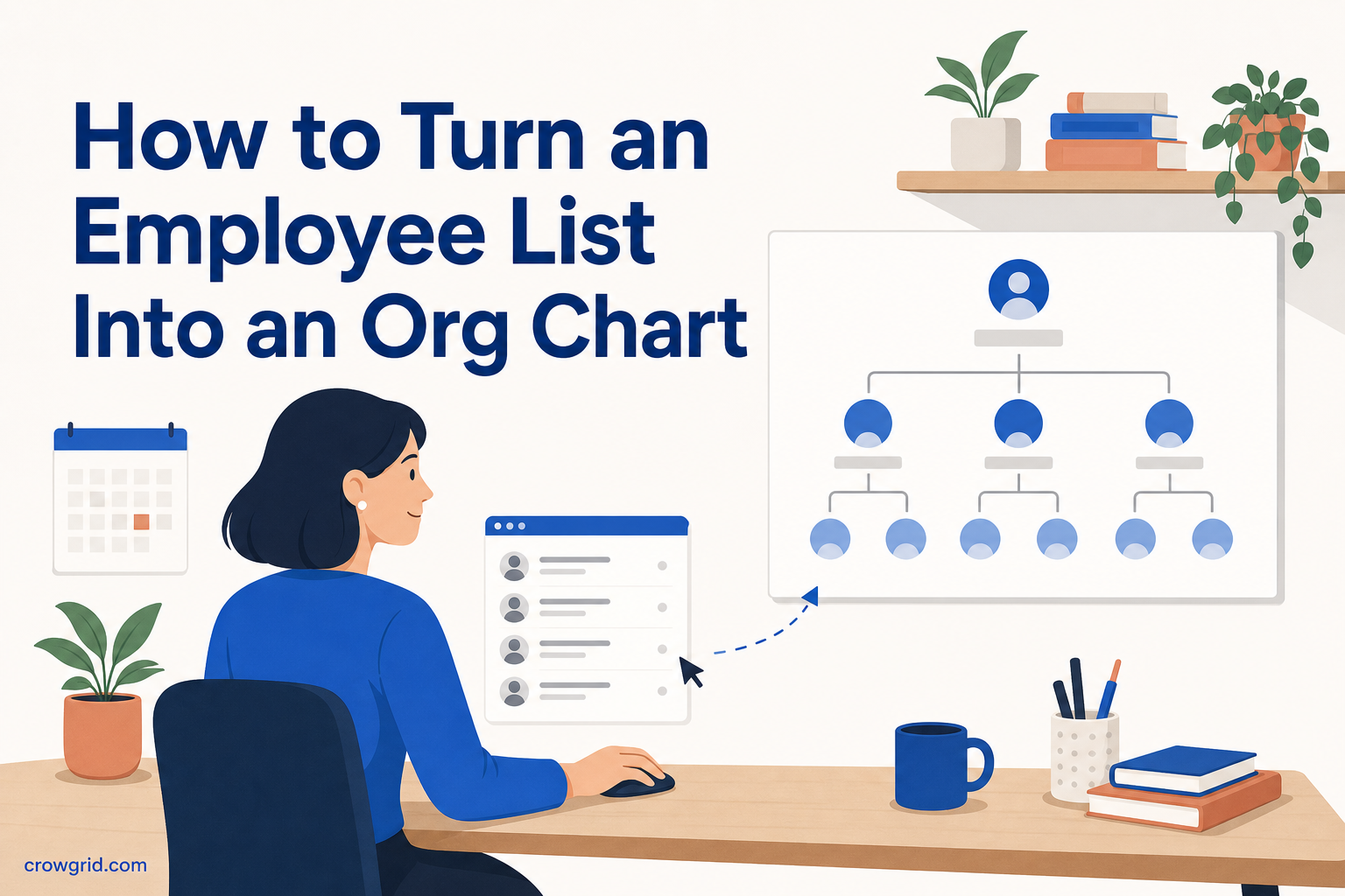
An employee list tells you who works at an organization. An org chart adds the context that list is missing: roles, managers, reporting lines, and the overall team hierarchy. Org Chart Maker turns those details into a clear visual chart without requiring design skills.
The process has three main steps. You add your employees, assign each person to a manager, and explore the resulting organization tree. You can then edit, share, or export the chart as needed.
Prepare your employee list
Before building the chart, collect the basic information you want to include for each person. You do not need to map the layout or draw connections manually. The reporting relationships will determine the chart structure.
A useful starting list includes:
- Each employee’s name
- Their role or position
- Their manager
- Any extra information you want to keep with their record
- A profile photo, if you want a more recognizable chart
It helps to check that manager names are consistent. If one employee is listed under “Sam Lee” and another under “Samuel Lee,” confirm whether those entries refer to the same person before setting the reporting lines.
You can build a chart for a small team or a larger organization. The tool supports flat teams, deep hierarchies, and matrix organizations, so your employee list does not need to fit a single standard structure.
Step 1: Add employees and their details
Start by entering each employee into the chart. Add their name, role, and any extra information that will help people understand where they fit in the organization.
Roles and titles are especially useful when several people have similar responsibilities or when someone viewing the chart does not know every employee. A clear title gives each chart entry immediate context.
You can also add employee photos. Photos are optional, but they can make a chart easier to scan and help colleagues connect names with faces. This is useful for distributed teams, new employees, or organizations with several departments.
You do not have to enter every possible detail at once. Begin with names and roles if that is all you have, then return to the editable records when more information is available. Org Chart Maker provides both table and chart views, so you can work with employee data as a list before reviewing it visually.
Step 2: Define the reporting structure
Once the employees are listed, assign each person to their manager. These manager assignments create the reporting lines that connect the organization.
You do not need to position boxes or draw connectors. As you define who reports to whom, Org Chart Maker builds the hierarchy automatically. A department head can be assigned to an executive, team members can be assigned to their team lead, and the structure continues through as many levels as you need.
Work from the top of the organization downward when possible. Identify the person or people at the highest level, then assign their direct reports. Continue through each team until everyone has the correct manager.
The table view is useful during this stage because it lets you review employee records and reporting assignments in an editable format. If the resulting structure does not look right, check the manager assignment for the affected employee. Changing that relationship updates where the person appears in the hierarchy.
This approach works for a flat organization with few management layers as well as a deeper structure with many reporting levels. It also supports matrix organizations, where the overall structure may be more complex than a simple department list.
Step 3: Explore the completed org chart
After the reporting lines are defined, the full organization tree is rendered as an interactive chart. You can see how individual employees, teams, managers, and senior roles connect without arranging the visual layout yourself.
Use zoom and pan controls to move through the structure. A broad organization can be viewed at a high level, while a closer view lets you inspect a specific team or reporting branch. This makes the same chart useful for both an overview and a more detailed review.
The visual chart can help you answer practical questions quickly:
- Who manages a particular employee?
- Which roles report to a department lead?
- How many reporting levels sit between two parts of the organization?
- Where does a new role belong?
- Which areas have flat or deep reporting structures?
You can switch back to the table view whenever you need to edit employee information or reporting lines. The chart gives you the visual overview, while the table provides a direct way to maintain the underlying records.
Org Chart Maker works on desktop, tablet, and mobile. You can view or edit the chart from the device that is convenient for the task, whether you are entering a larger employee list or checking a reporting relationship away from your desk.
Keep the chart useful over time
An org chart is most helpful when it reflects the current organization. When someone joins, add their employee record and assign a manager. When a role changes, update the title or other details. If a person moves to another team, change their reporting line so the hierarchy renders in the correct place.
Regular updates are easier when the chart has a clear level of detail. Decide which information belongs in each employee record and apply that choice consistently. Names, roles, managers, and photos are often enough for a chart that needs to remain easy to scan.
Because the table and chart views show the same organizational information in different ways, you can use each one for the task it handles best. Review and edit records in the table, then use the chart to check the organization as a whole.
Share or export the result
Once the structure is ready, you can share the org chart with colleagues. This gives other people a clearer way to understand reporting relationships than a plain employee list.
You can also export the chart for use in presentations. Before exporting, review names, titles, employee details, and manager assignments. A quick check in both table and chart views can catch incomplete records or reporting lines that need correction.
The chart can support onboarding, organization planning, team reviews, and internal presentations. The same underlying structure remains editable, so you can update it rather than rebuilding the visual chart whenever the organization changes.
Frequently asked questions
How many employees can I add for free?
You can add up to 100 employees for free. No credit card is required to get started. Open the app, enter your employee records, and begin assigning reporting lines.
Can I create a chart with several management levels?
Yes. You can create as many hierarchy levels as you need. Org Chart Maker supports flat teams, deep reporting structures, and matrix organizations. The chart is generated from the manager assigned to each employee.
Is employee data protected?
Yes. Data is protected with industry-standard encryption in transit and at rest. This applies to the information you store in the tool, including employee names, roles, extra details, reporting relationships, and photos.
Turn your employee list into a clear team hierarchy with Org Chart Maker.